

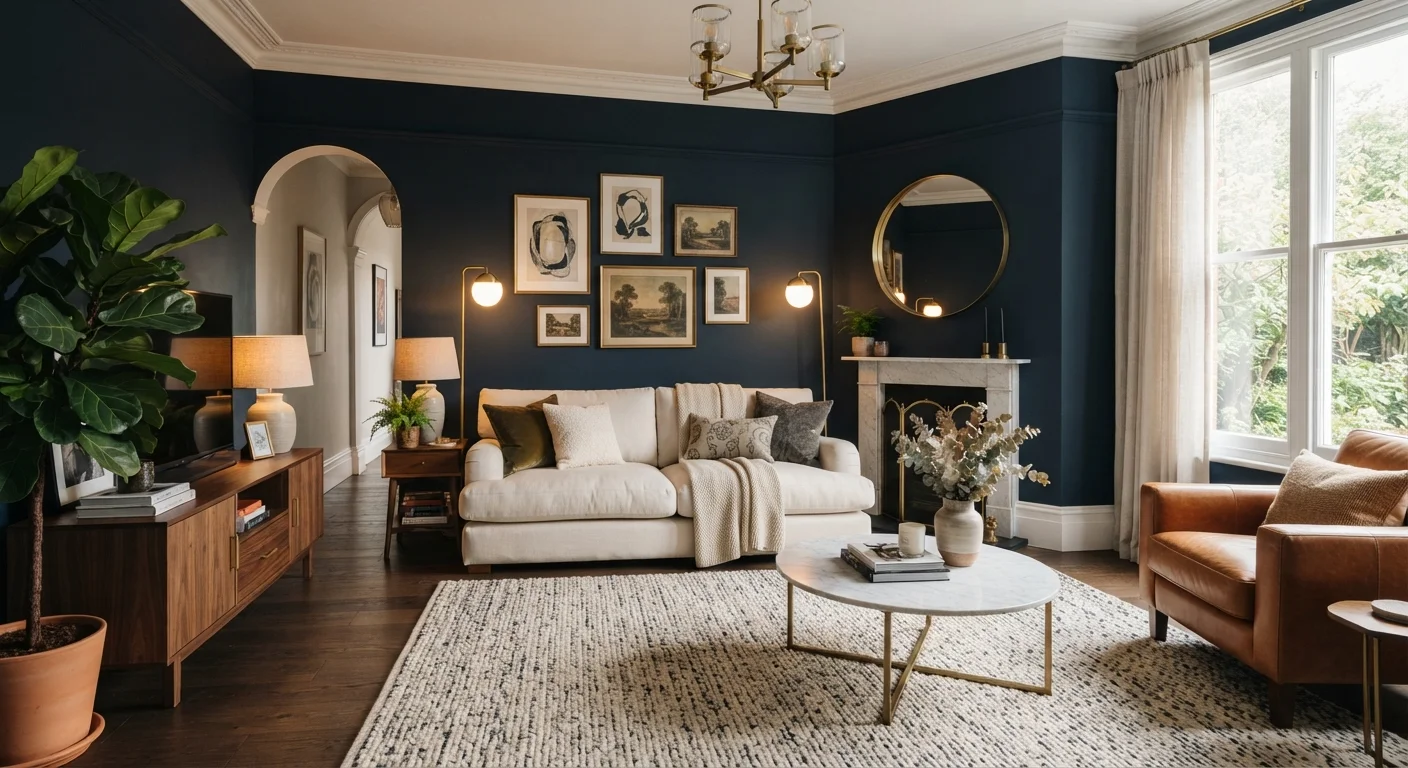
The Case for Reconsidering Dark Paint
Ask most homeowners why they avoid dark wall colours, and the answer is almost always the same: "It'll make the room feel small." That fear is understandable - and almost entirely overstated. Dark paint has earned a reputation it doesn't fully deserve, driven by a handful of design myths that persist long after designers have moved past them.
The truth is that colour perception is far more complex than a simple light-equals-spacious equation. How a room reads depends on its natural light, ceiling height, furnishing scale, finish sheen, and how the colour interacts with adjacent surfaces. Understanding those variables is what separates a dark room that feels dramatic and intentional from one that simply feels gloomy.
Before choosing any colour direction, it helps to understand how natural light reshapes how colour behaves in different rooms throughout the day - because the same paint chip can look entirely different at 9am versus 7pm.
Myth
Dark paint will make any room feel smaller and more cramped.
Fact
Dark colours create enclosure, which can feel intimate and deliberate - not necessarily cramped. Perceived size depends on many factors beyond wall colour.
Spatial perception is shaped by ceiling height, furniture scale, the ratio of wall to window area, and how light moves through a space. A dark room with high ceilings, minimal furniture, and strong light sources often reads as expansive. Conversely, a pale room cluttered with oversized furniture can feel suffocating. The relationship between colour and space is contextual, not fixed. Designers frequently use dark colours in small rooms precisely to make them feel purposeful and cosy rather than simply small - a concept explored further in our piece on design principles for compact spaces.
Myth
Dark rooms are always cold and uninviting.
Fact
Whether a dark room feels warm or cold depends almost entirely on the undertone of the paint, not its depth of colour.
A deep charcoal with blue undertones will read cool and crisp. A near-black with red or brown undertones can feel as warm as a wood-panelled study. Dark greens with yellow bases, deep terracottas, and rich burgundies are inherently warm despite their depth. Selecting the right undertone for your room's existing furnishings and light quality is the real skill - not simply avoiding dark colours altogether. Sample large swatches (at least 12 inches square) on the actual wall and observe them across morning, afternoon, and evening light before committing.
Myth
You should only use dark paint in large rooms with plenty of natural light.
Fact
Dark colours can work well in low-light rooms when the goal is atmosphere rather than the appearance of maximum size.
A north-facing dining room, a windowless hallway, or a basement den may never feel bright regardless of paint colour. In those spaces, leaning into the darkness - rather than fighting it with pale colours that still look grey - can produce a rich, deliberate result. Candlelit deep tones, warm pendant lighting over a dark-walled dining area, or a jewel-toned library nook are classic examples of low-light rooms that use colour as an asset. The aim shifts from maximising perceived light to creating a specific mood.
Myth
Dark paint is a trend that dates a home quickly.
Fact
Deeply saturated wall colours have appeared consistently in design history across cultures and centuries - they are not a fleeting trend.
Dark wall colours appear in Georgian parlours, Victorian libraries, mid-century studies, and contemporary Scandinavian interiors alike. While specific shades cycle in and out of fashion, the broader principle of using deep, saturated colour as a design tool is enduring. Choosing a dark colour grounded in your home's architectural character and your own aesthetic - rather than chasing a specific shade trending on social media - tends to produce results that remain satisfying well beyond any particular design moment.
Myth
Dark paint ruins resale value because buyers always want neutral walls.
Fact
There is no universal buyer preference for pale neutrals; a well-executed dark interior can be a genuine selling point.
Buyer preferences vary enormously by region, price point, and property type. A thoughtfully painted dark study or a dramatic dining room can read as a premium feature rather than a liability, particularly in higher-end properties where buyers expect character. That said, broadly unusual or very personalised colour choices in high-traffic areas do carry some risk. If resale is a near-term priority, concentrating dark colours in accent spaces - a single feature room, a hallway - gives you the aesthetic benefit while limiting potential buyer hesitation elsewhere.
Making Dark Colours Work in Practice
Choosing to go dark is only the first decision. How you execute it determines whether the result feels considered or oppressive. A few practical principles go a long way.
3×
More coats typically needed for deep colours
Professional painters commonly note that highly pigmented dark shades require two to three coats for even, streak-free coverage compared to one to two for most light colours.
12"
Minimum sample swatch size recommended
Interior designers broadly advise testing paint on at least a 12-inch square patch directly on the wall, rather than relying on small chips, to accurately judge undertone and depth.
Commit to the ceiling. Painting the ceiling the same dark colour as the walls - or one shade lighter - wraps the room in colour and creates an enveloping effect that reads as intentional rather than accidental. Stopping colour at the wall-ceiling junction can make dark walls look unfinished.
Think carefully about finish. Dark colours amplify surface imperfections under certain sheens. Paint sheen behaves differently under light, and a flat or matte finish on dark shades tends to absorb light beautifully while hiding wall flaws - a useful combination. Higher-sheen finishes can reflect light unpredictably.
Layer your lighting. Dark walls absorb ambient light rather than reflecting it, so overhead-only lighting will feel flat and dim. Layered lighting strategies - sconces, table lamps, directional spotlights - create the warmth and dimensionality that make dark rooms come alive after sunset.
Don't Skip the Primer When Going Dark
Applying a dark finish coat directly over a lighter existing colour - or unprepared drywall - almost always leads to uneven coverage and colour shift. Ask your paint supplier about tinted primers matched to your dark shade; they reduce the number of finish coats needed and improve the final colour accuracy significantly.
Surface prep matters more, not less. Every flaw, patch, and roller mark is more visible under deep pigment. Thorough surface preparation - filling, sanding, and priming - is non-negotiable before applying a dark colour. Budget for two or three coats; most dark shades need them.
If you're still calibrating your instincts around warm versus cool shades before committing, our guide on warm tones vs. cool tones can help you identify which direction suits your space and furnishings.
The content provided on our blog site traverses numerous categories, offering readers valuable and practical information. Readers can use the editorial team’s research and data to gain more insights into their topics of interest. However, they are requested not to treat the articles as conclusive. The website team cannot be held responsible for differences in data or inaccuracies found across other platforms. Please also note that the site might also miss out on various schemes and offers available that the readers may find more beneficial than the ones we cover.