

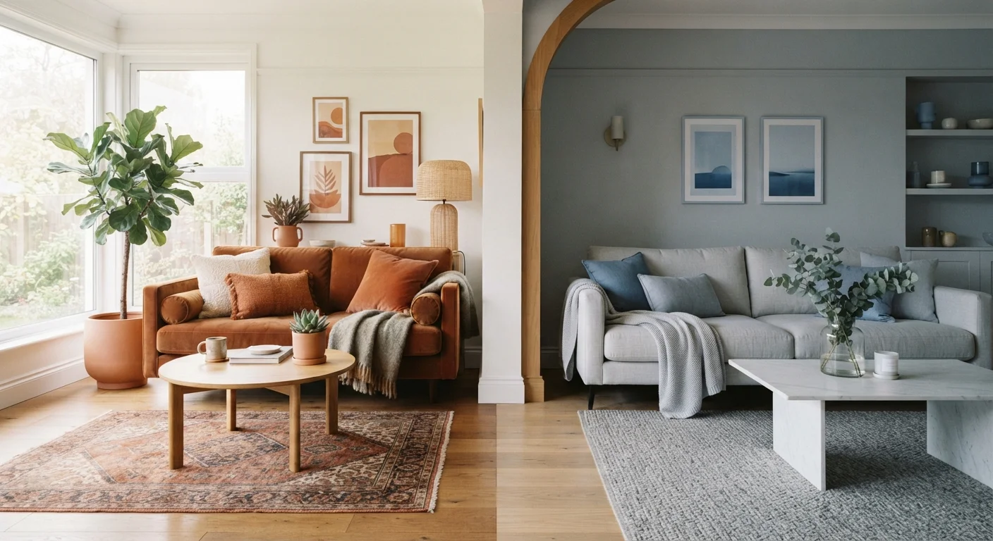
Option A
Warm Tones
The inviting, energising choice for cosy, intimate spaces.
Best for: Living rooms, dining areas, and bedrooms where comfort and social warmth are priorities.
Option B
Cool Tones
The calm, spacious-feeling option for focused or restful environments.
Best for: Home offices, bathrooms, and open-plan spaces where clarity and visual breathing room matter.
What Makes a Colour 'Warm' or 'Cool'?
Colour temperature refers to where a hue sits on the colour wheel relative to red and blue. Warm colours - reds, oranges, yellows, and the earthy neutrals derived from them (terracotta, ochre, caramel) - are associated with fire, sunlight, and physical warmth. Cool colours - blues, blue-greens, lavenders, and grey-based neutrals - evoke water, sky, and shade.
The distinction matters in interior design because of how the human eye processes these hues. Warm colours appear to advance toward the viewer, which creates a sense of closeness and enclosure. Cool colours appear to recede, generating an impression of distance and openness. Neither effect is better - they serve different spatial and emotional goals.
Importantly, most colours contain a mix of warm and cool undertones. A white can lean creamy and warm, or icy and cool. A green can pull toward warm yellow-green or cool blue-green. Understanding undertones is a key part of building a coherent palette - something explored in detail in our core interior design concepts guide.
| Criterion | Warm Tones | Cool Tones |
|---|---|---|
| Visual effect on space | Advances; room feels smaller, cosier | Recedes; room feels larger, airier |
| Emotional association | Energy, comfort, intimacy | Calm, clarity, focus |
| Best room function | Living, dining, welcoming areas | Office, bathroom, open-plan |
| Performance in low light | Adds perceived warmth and brightness | Can feel flat or cold in dim rooms |
| Performance in strong sunlight | May intensify and feel overwhelming | Balances brightness; stays fresh |
| Common hues | Terracotta, ochre, amber, warm beige | Slate blue, sage, grey, cool white |
| Pairing with wood tones | Harmonises naturally | Creates deliberate contrast |
| Trend durability | Enduring; cycles in and out | Enduring; cycles in and out |
How Light Changes Everything
No colour exists in isolation from the light around it. Natural light direction is one of the most important - and most overlooked - variables when choosing a palette.
- North-facing rooms receive indirect, bluish light that can make cool tones feel flat or cold. Warm neutrals and earthy hues typically perform better here.
- South-facing rooms get bright, direct light for most of the day. Both warm and cool tones work, but warm colours can intensify significantly under strong afternoon sun.
- East-facing rooms are bathed in warm morning light that shifts to cooler tones by afternoon - a factor if the room is used primarily at a specific time of day.
- West-facing rooms gather golden late-afternoon light, which flatters warm tones and can make cool greys look almost purple by evening.
Artificial lighting adds another layer of complexity. Bulbs with a lower colour temperature (around 2700K-3000K) cast warm yellowish light that enhances warm-toned walls but can muddy cool ones. Higher colour temperature bulbs (4000K+) support cool palettes more naturally. Our article on artificial lighting strategies explores this in depth.
2700K-3000K
Bulb colour temperature for warm interiors
Lighting industry standards classify bulbs in this range as 'warm white', most compatible with warm-toned wall palettes.
~10%
Perceived size difference with colour choice
Colour psychology research suggests cool, lighter colours can make a room feel noticeably more spacious compared to darker warm equivalents.
4
Light direction orientations affecting colour
North, south, east, and west exposures each produce distinct light quality that shifts how the same paint colour reads throughout the day.
Matching Palette Temperature to Room Function
Beyond aesthetics, colour temperature has a measurable psychological dimension that should inform room-by-room decisions.
Living Rooms and Dining Spaces
These social rooms benefit from the approachability of warm tones. Terracotta, warm taupe, or a deep ochre encourage lingering and conversation. Even a warm-leaning neutral on the walls - rather than a stark, cool grey - shifts the atmosphere toward comfort.
Bedrooms
Both temperatures can work here, depending on the mood you want. Warm tones create a cocoon-like intimacy; soft, desaturated cool tones (dusty blue, sage green) promote a calm, sleep-supportive atmosphere. The choice often comes down to whether you want the room to feel embracing or serene.
Home Offices and Studies
Cool tones are widely regarded as more conducive to focus and mental clarity. Soft blue-greens, pale greys, and muted sage can help a workspace feel professional without feeling sterile.
Bathrooms and Kitchens
Cool whites and grey-blues read as clean and hygienic, which is why they dominate these spaces. Warm-toned bathrooms are increasingly popular, however - pale terracotta or warm stone creates a spa-like rather than clinical feel. See also our guide to natural light for how window placement should inform these choices.
Always Test Before You Commit
Paint swatches and digital previews are useful starting points, but they're not reliable substitutes for real-world testing. Apply large sample patches (at least 12 inches square) on your actual walls and observe them at different times of day and under both natural and artificial light. A colour that looks perfect on a north-facing wall at noon may read very differently by lamplight in the evening. Most paint retailers offer sample-size quantities specifically for this purpose.
Blending Both: The Mixed-Temperature Approach
Restricting a room entirely to one temperature family often produces a flat result. Professional designers routinely layer warm and cool elements to create tension and interest - the technical term for this deliberate contrast is temperature balance.
Common approaches include:
- A cool-toned wall palette anchored by warm wood flooring or furniture
- Warm-toned upholstery in a predominantly cool, airy room
- Introducing warm metallic accents (brass, copper) into a cool grey or blue-green scheme
- Using warm-toned artwork or textiles as a counterpoint to cool architectural finishes
The key is intentionality: identify your dominant temperature and introduce the opposite in smaller doses. A room that reads primarily cool but includes a warm linen sofa or honey-toned wood shelf feels considered rather than cold. Conversely, a warm-dominant room with a few cooler elements avoids feeling heavy.
If your interior leans toward a minimalist aesthetic, understanding how temperature interacts with simplicity is worth exploring in our Scandinavian vs. Japandi comparison. And if you're considering deeper, more dramatic hues, dark paint colours deserve more credit than they get explains how temperature still applies at higher saturation levels.
The content provided on our blog site traverses numerous categories, offering readers valuable and practical information. Readers can use the editorial team’s research and data to gain more insights into their topics of interest. However, they are requested not to treat the articles as conclusive. The website team cannot be held responsible for differences in data or inaccuracies found across other platforms. Please also note that the site might also miss out on various schemes and offers available that the readers may find more beneficial than the ones we cover.