

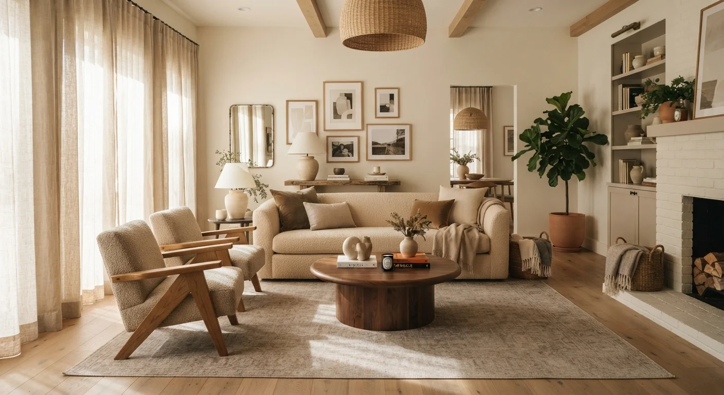
Balance: Making a Room Feel Stable
Balance is the distribution of visual weight throughout a room. It doesn't require perfect symmetry - in fact, some of the most compelling spaces rely on asymmetrical balance, where different objects carry equivalent visual weight without mirroring each other.
There are three types designers recognize:
- Symmetrical balance: Matching elements on either side of a central axis - two identical nightstands flanking a bed, for example. It reads as formal and calm.
- Asymmetrical balance: Different objects arranged so their combined visual weight feels equal - a tall plant offset by a cluster of smaller objects on the opposite side.
- Radial balance: Elements radiating outward from a central point, like chairs arranged around a circular dining table.
Visual weight is determined by size, color, texture, and pattern. A dark sofa carries more weight than a pale one; a heavily textured rug draws more attention than a plain floor.
Test Balance Before You Commit
Before moving heavy furniture, take a photo of the room and convert it to grayscale. Without color, visual weight becomes much easier to assess. Dark masses and large shapes stand out clearly, helping you spot imbalances that are easy to overlook in person.
Scale and Proportion: Getting Sizing Right
Scale is how the size of an object relates to the room it occupies. A large sectional in a compact apartment throws scale off immediately. Proportion, by contrast, is how objects relate to each other - a petite side table next to an oversized armchair is a proportion mismatch, regardless of room size.
Getting both right is one of the most common challenges homeowners face. A useful rule of thumb: anchor each seating area with a rug large enough that the front legs of all furniture sit on it. This grounds the grouping and signals intentional scale. Coffee tables should generally sit about two-thirds the length of the sofa they serve.
2/3
Coffee table-to-sofa length ratio guideline
Widely used by interior designers as a proportional starting point for sizing a coffee table relative to the sofa it anchors.
3
Objects in a visually pleasing grouping (rule of odds)
The 'rule of odds' is a long-standing compositional principle suggesting that groupings of odd numbers - especially three - tend to feel more dynamic and balanced than even-numbered arrangements.
If you're working through a room from scratch, our guide for first-time decorators walks through spatial planning with these principles applied step by step.
Rhythm, Emphasis, and Harmony: The Principles That Unify a Space
Rhythm in a room works the way it does in music - through repetition and pattern. Repeating a color across three or four objects, or echoing a rounded shape in multiple places, creates a visual flow that makes a space feel intentional rather than random.
Emphasis (also called focal point) gives the eye somewhere to land. In most rooms, one element should dominate - a fireplace, a statement piece of art, a dramatic window. Without emphasis, every element competes equally for attention, and the result feels chaotic. With it, the room has a clear hierarchy.
Harmony is the overarching sense that everything belongs together. It doesn't mean everything matches - it means elements share enough common ground (color family, material, stylistic era) that the space reads as curated rather than assembled by accident.
Principles Are Guides, Not Rules
Every principle in design has been deliberately broken by skilled designers to create interest or tension. Understanding the rules matters most because it lets you break them intentionally. If a room violates a principle and still feels right to you, that's a valid creative decision - not a mistake.
Light interacts with all of these principles in significant ways. Our article on how natural light reshapes rooms explores how light direction and quality affect color, proportion, and mood throughout the day.
For a deeper look at how these principles apply across a full design project, see Interior Design From Concept to Completion.
Frequently Asked Questions
Balance is often the best starting point because it directly affects how comfortable a room feels. Once you understand how visual weight works, other principles - proportion, rhythm, emphasis - build naturally on top of it.
Scale describes how an object's size relates to the room itself - a large sectional in a small room is a scale problem. Proportion describes how elements relate to each other - a tiny lamp on an oversized table is a proportion problem.
Rhythm refers to a sense of visual movement created by repeating elements - the same color appearing in a throw pillow, a vase, and a piece of art, for example. It guides the eye through a space and creates a sense of flow.
Not at all. These principles are tools anyone can learn and apply. Understanding them helps you evaluate your own space critically and make more intentional decisions when decorating.
Principles like emphasis and harmony work hand-in-hand with color. A bold accent color can establish a focal point, while a consistent palette supports harmony. See our <a href="/home-garden/interior-design/warm-tones-vs-cool-tones-choosing-a-colour-direction-for-your-home">guide to warm and cool tones</a> for more on using color direction effectively.
Our <a href="/home-garden/interior-design/interior-style-glossary-defining-30-design-terms-youll-actually-encounter">interior style glossary</a> defines 30 terms you'll encounter in magazines, showrooms, and mood boards - a useful companion to this article.
The content provided on our blog site traverses numerous categories, offering readers valuable and practical information. Readers can use the editorial team’s research and data to gain more insights into their topics of interest. However, they are requested not to treat the articles as conclusive. The website team cannot be held responsible for differences in data or inaccuracies found across other platforms. Please also note that the site might also miss out on various schemes and offers available that the readers may find more beneficial than the ones we cover.