

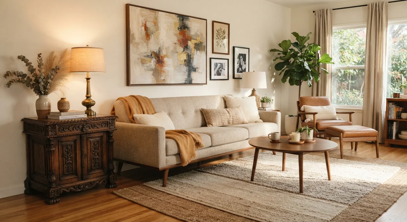
Why Eclectic Rooms Succeed or Fall Apart
Most rooms that feel chaotic aren't eclectic - they're just unedited. Genuine eclecticism isn't the absence of rules; it's the application of design principles across a broader range of sources than a single-style room allows. Understanding what holds a mixed interior together is the first step to applying it intentionally.
The underlying logic comes down to three connective forces: color, scale, and material repetition. When these are consistent, the eye reads the room as unified even when the individual pieces span centuries. When they're absent, even well-chosen pieces can feel like they belong in different homes. For a deeper grounding in how design vocabulary describes these relationships, see the Interior Style Glossary covering terms you'll encounter in mood boards and showrooms.
68%
Homeowners who mix furniture from different eras
According to Houzz's North America Home Design Trends Survey, a majority of homeowners report combining furniture pieces from different time periods in the same room.
3-5
Recommended palette tones for eclectic cohesion
Interior design educators commonly recommend limiting a room's color story to three to five related tones to maintain visual unity across diverse furnishings.
The Role of a Unifying Color Palette
Color is the fastest shortcut to coherence. A Victorian armchair reupholstered in the same dusty sage that appears in a nearby abstract print suddenly belongs in a room with a Scandinavian-influenced sofa. The style of each piece matters less when the color story is consistent.
A practical approach: choose a palette of three to five tones before acquiring or arranging pieces. These don't need to be identical across every object - variation in value (light to dark) and saturation (muted to vivid) adds life - but they should be clearly related. Neutrals carry the structure; one or two accent colors do the connective work.
Test Colors Together Before Committing
Before reupholstering or painting, gather physical swatches of your key fabrics, paint chips, and wood samples and view them together in the room's actual light - both daylight and evening artificial light. Colors that appear harmonious on a screen or in a store can shift significantly in context. This simple step catches mismatches before they become expensive mistakes.
Note that color temperature also matters. Warm-toned woods, amber glass, and terracotta read as a family even without matching hues. Mixing warm and cool tones without intention is one of the most common reasons a room feels off.
Scale, Proportion, and Visual Weight
A spindly antique side table placed next to a substantial modern sectional creates an uncomfortable imbalance - not because the styles clash, but because the visual weights are mismatched. In eclectic interiors, pieces from different eras need to share a sense of scale even when their silhouettes differ dramatically.
Visual weight is determined by factors like mass, darkness of color, and complexity of detail. A heavily carved mahogany console has high visual weight; a slim powder-coated steel shelf has low visual weight. Placing high-weight pieces together on one side of a room while low-weight pieces cluster on the other creates imbalance. Distribute visual weight the way you'd balance a composition in a painting - across the whole frame.
For practical guidance on how scale decisions play out in arrangement, the furniture layout decisions guide covers traffic flow and focal points that underpin every eclectic arrangement.
Material Repetition as a Quiet Unifier
Beyond color and scale, material repetition is the technique most often used by professional decorators to create rhythm in an eclectic room. Choose one or two materials - brass, linen, rattan, matte black iron - and thread them through the space in different forms.
Brass might appear in a vintage lamp base, a contemporary picture frame, and a set of cabinet hardware. None of these pieces needs to match in style or era; the shared material creates a visual conversation between them. This is particularly effective when mixing periods, because it gives the eye a familiar element to return to.
Texture adds a related layer. For a detailed approach to layering materials without creating clutter, the guide to layering rugs, textiles, and texture explains how to use surface variety to add depth rather than noise.
When Mixing Metals, Contrast Intentionally
Mixing metal finishes - brass, chrome, matte black, bronze - is widely accepted in eclectic interiors, but near-matches create an unintentional, unresolved look. If you're combining metals, make the contrast clear: warm brass alongside cool brushed nickel reads as a deliberate choice. Aim for a 70/30 split, with one finish dominant and the other used as an accent.
Editing: The Step Most Decorators Skip
Successful eclectic rooms are edited as deliberately as they are assembled. Every piece should earn its place by connecting to at least two other elements in the room - through color, material, scale, or mood. If an object only relates to one other thing, it's a candidate for removal or relocation.
A useful exercise: photograph the room and view it in black and white. Without color distraction, scale relationships and visual weight become immediately apparent. Pieces that feel disconnected in the photo are the ones worth reconsidering.
If you're starting from a blank slate rather than editing an existing room, the room-decorating guide for first-timers walks through the sequencing decisions that make the process more manageable. And before any significant redecorating effort, a room-by-room interior audit can reveal which existing elements are worth keeping as anchors for a new eclectic direction.
“Eclecticism at its best is not about mixing everything you love into one room. It's about understanding what connects the things you love, and letting that connection do the work.”
— Home & Garden Editorial Team, Interior Design Specialists
Frequently Asked Questions
Eclectic design mixes styles and eras with an emphasis on cohesion - every piece has a reason to be there. Maximalist design embraces abundance and layering, often with a deliberately dense or exuberant aesthetic. An eclectic room can be relatively minimal; a maximalist room celebrates fullness as a design value in itself.
Most designers suggest anchoring a room in one dominant style and pulling from one or two others as accents. Mixing more than three distinct influences in a small space often creates visual noise rather than intentional contrast. Restraint within variety is the key to cohesion.
Focus on a unified color palette, consistent scale relationships, and repeated materials. Limiting your accent colors to two or three across the whole room, and ensuring larger furniture pieces share similar visual weight, prevents the space from feeling scattered.
Yes - mixing wood tones is very common in eclectic rooms. The key is to vary them intentionally: aim for contrast (a light oak floor against a dark walnut table) rather than near-matches that look like accidental mismatches. Tying the woods together with a consistent upholstery or rug color helps.
Start with one piece you love - an heirloom, a vintage find, or a statement artwork - and build outward from its colors, scale, and mood. This 'anchor piece' approach gives you a reference point for every subsequent decision rather than assembling items with no connective thread.
The content provided on our blog site traverses numerous categories, offering readers valuable and practical information. Readers can use the editorial team’s research and data to gain more insights into their topics of interest. However, they are requested not to treat the articles as conclusive. The website team cannot be held responsible for differences in data or inaccuracies found across other platforms. Please also note that the site might also miss out on various schemes and offers available that the readers may find more beneficial than the ones we cover.